Somehow I continue to get drawn to existential narratives, both in film and in print… Must be a sign of impending middle age? Regardless of where this curious preference comes from, it’s been fully embraced as long as it keeps suggesting or inspiring interesting imagery.
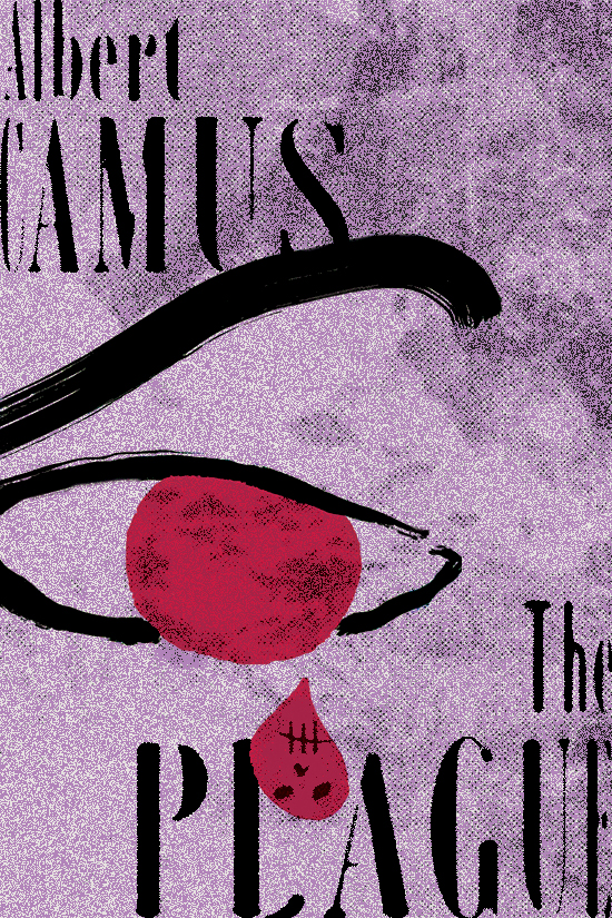
Here is a reimagining of the book cover design and illustration for one of Albert Camus’ timeless classics.
“[…] Most important is always to have a play back and forth, back and forth. Between the big and the little, the light and the dark, the smiling and the sad, the serious and the comic.“—BEN SHAHN
Had been wanting to design a book cover for Roland Topor‘s classic novel The Tenant for a long time, and finally buckled down to tackle it. A macabre, darkly funny tale of paranoia and existential angst, it was popularized here in the US by Roman Polanski’s 1976 film adaptation.
It has been a while since I’ve written something here, so please bare with me—my words might come out a little bit ruffled and/or rusty.
Having said this, hopefully it won’t be true of the new set of drawings I’ve been working on.
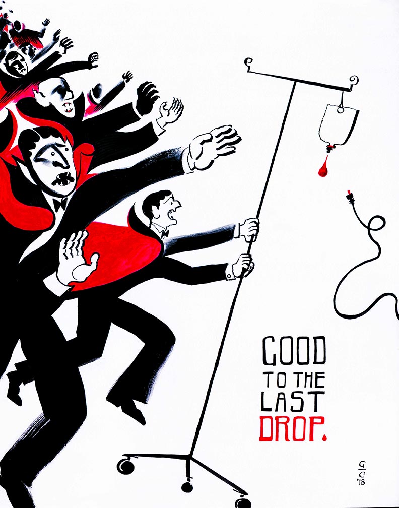
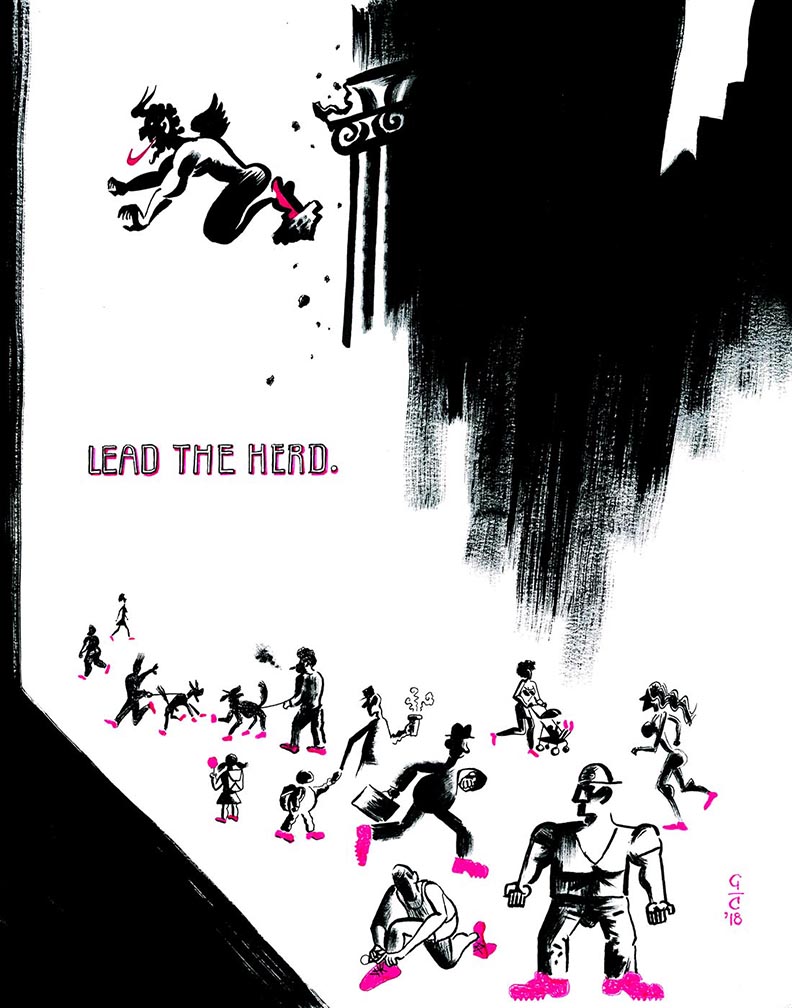
The Evils of Consumerism: Good To the Last Drop
These were not commissioned, but actually started life last summer in my sketchbook as small experiments with visual puns and playful graphic shapes. The ideas that came out also reflected my current preoccupation with direct, bold visual storytelling through accessible metaphors—all peppered with tongue-in-cheek humor.
Early idea for the series
Initial sketchbook tomfoolery
Humor is an element in my work that I’ve mostly tried to downplay or even suppress for several years, likely for fear of coming across as “not serious enough” as an artist or visual communicator. Of course this was probably never an issue for many of my heroes, Tomi Ungerer, Saul Steinberg, and Quino among them—all artists that proved that graphic humor can be infused with poetry and wit, while still tackling “serious” subjects; such as the tumults of daily life and their often inevitable existential challenges.
The Evils of Consumerism: Lead The Herd
So, deciding to let the tone of the new ideas evolve naturally—and after telling my inner critic to go peruse some vintage cartoon books—the vehicle for the humor (and target of my admittedly twisted imagination) soon appeared trough the ballpoint haze…
Sketches for what became Lead The Herd
Like any other New Yorker, I find myself staring at subway posters while I wait for my commuting train. Without getting preachy and seeming hypocritical, I often get baffled by modern advertising and its vacuous promises of ever-lasting bliss with products that often can barely fulfill their own intended function. Most crucially, there’s the underlying suggestion that the more we acquire or consume, the happier we could (or should) be, which of course rarely is (if ever) true.
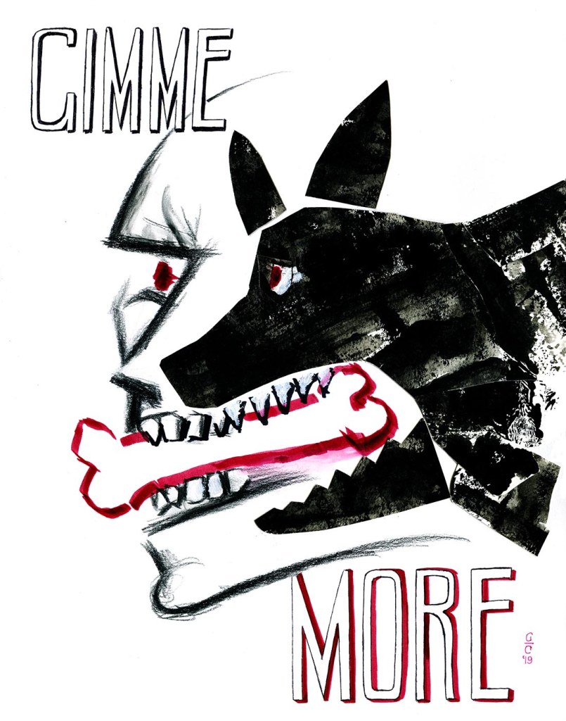
The Evils of Consumerism: Gimme More
Most of us are aware of this. And yet these glossy, pitch-perfect ads that seem to be concocted in a parallel but seemingly faultless world keep luring us into dispensing with our hard-earned cash, in exchange for some ever-elusive nugget of happiness that we’re apparently (inexplicably!) deprived of.
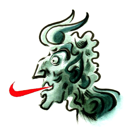
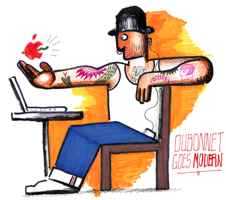
An early idea that payed homage to Cassandre’s immortal Dubonnet Man (while spoofing you-know-who), which I eventually abandoned after deciding it did not fit the tone and intent of the series.
It’s a trap we can’t help but fall into, whether we’re aware of it or not. It poses an interesting conundrum, as well as certain questions of identity and self-contentment. Fitting fodder for the pseudo-ads and aforementioned visual puns that started emerging from my sketchbook—some of them reproduced here in their rawest form.
The Evils of Consumerism: One Cup is Not Enough
On a more technical note, I wanted to experiment with two-tone graphics—usually letting the second color highlight the emotional or conceptual aspects of each piece, while playing with the visual balance of the colors (and I certainly think of black as a color) on the page.
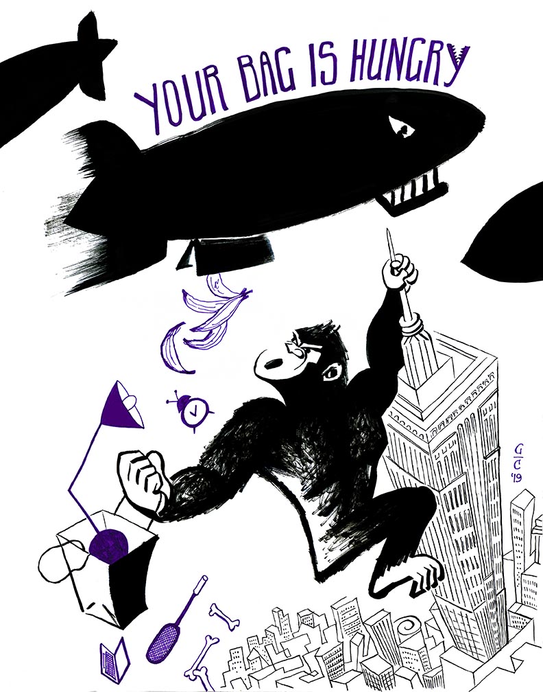
The Evils of Consumerism: Your Bag Is Hungry
Another interesting but enticing challenge was to find ways to add visual variety and expression with that limited palette, and that’s where mark-making and texturing became essential ingredients in each drawing.
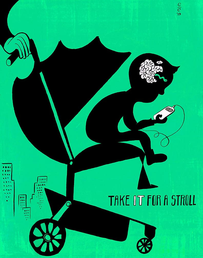
The Evils of Consumerism: Take It For a Stroll
Making these images also reminded me of an important lesson that’s surely old hat to many seasoned creatives: let your work breathe and grow without trying to control its direction too much. The more you play and listen to your intuition, the more the outcome will surprise you.
As of this writing, I’m not sure whether there will be more pieces added to this series, but—as a whole—I consider them a breakthrough of sorts. They allowed my “funny bone” to resurface, and hinted at other directions to pursue.
Sometimes the simplest of ideas drive through some bumpy roads before emerging triumphantly. Other times, whatever comes out of the tunnel bears only a vague resemblance to the original scribble in your sketchbook—which can be a drag or a boost, depending on your intentions. A bit of both happened with this particular assignment.
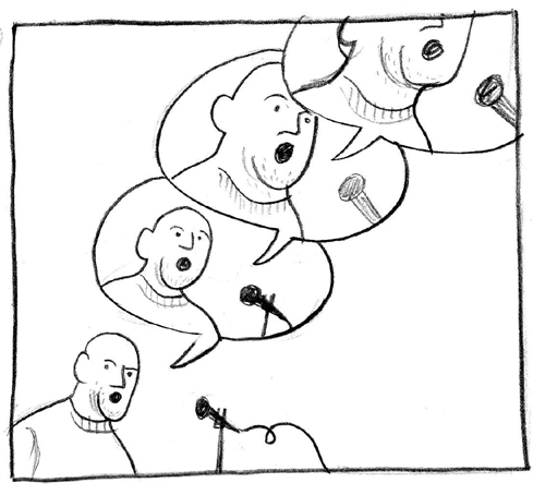
This illustration is appearing in the January issue of Reader’s Digest UK, due in newsstands across the pond sometime this month (still not sure if it’s available here in the US or elsewhere). The article it accompanies delves into British news media’s current preference for the viewpoints of non-experts on any given topic, and questions how this focus could influence the way we perceive information.
I had the pleasure of working once again with the Digest‘s design director Martin Colyer, who vastly improved my original idea by suggesting that the opinionated fellow in the drawing should grow angrier with each speech balloon. Initial (admittedly undercooked) sketch posted below…
The article reawakened the cartoonist in me. This proved to be a golden opportunity to have fun with characterization (as seen in the finished piece): enriching the idea with descriptive visual details about the “leading man”, while being careful to not overpower the image with superfluous information. It was tempting to render the whole thing with pen & ink and lush watercolors, but I realized right away that such a direct, catchy pun demanded a more, um… full-throated approach.
And so, Photoshop came to the rescue to put it all together: I drew our spot-lit spokesman with wax crayon (a medium I’m scarcely comfortable with) to emphasize his gruff street-wise roots; rendering each increasing frown and widening mouth separately, then composing them together digitally. Textures and patterns such as the houndstooth print on his cap (“sampled” from one of my wife’s vintage dresses) and the table he leans on (an unused shelf from my bookcase that I placed directly into my scanner) were also collaged in via Photoshop to add some visual interest. Even though I’ve used Photoshop to compose images before, I’m very glad I went with my instincts, tried some new variations on the usual methods, and ultimately avoided going down some of the more familiar routes.
The image then went through some minor aesthetic revisions, mostly to avoid dropping our flustered hero into the unavoidable page gutter (the narrow space in the binding between two pages) over which the printed article would spread. Indirectly, this was probably the biggest challenge proposed by the assignment, and one I always look forward to: how to balance all pictorial elements in the composition and pack the required punch, while working with specific page layout and print format restraints.
It’s difficult to take chances with commissioned work when a deadline is looming, but once we settled on the right idea, the art director gave me carte blanche to try whatever I pleased, approach-wise. Many thanks to Martin for trusting me enough to get on with it, and to the somewhat unpredictable wonders of digital technology for giving me enough guts to temporarily forget that failure is always an option.
Halloween aftermath/welcome to November: For the past two weeks, I’ve had the pleasure of collaborating with long-time friend Jesse Paris Smith and her fantastic New York-via-Michigan band Belle Ghoul. They specialize in spectral, lush, sugary pop, having recently released an EP of their own compositions through Elefant Records, as well as a smattering of singles, self-released tracks, and covers.
Jesse asked me to come up with artwork to accompany and promote their online-only/free-downloadable take on the Zombies classic Care of Cell 44—she said they were looking for a visual that was “sweet but spooky”. In case you’re not familiar with this little gem of 1960s British pop, Care of Cell 44 is written as a tender letter from a narrator who’s anxious to see his lover, after she’s completed an extended jail sentence for an unspecified crime.
Here’s a promotional poster I designed for an upcoming program of music-oriented films from the 1960s that my wife put together for Anthology Film Archives here in New York.
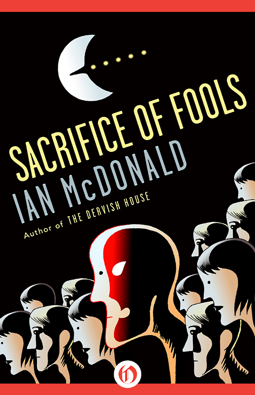
These are some of the cover designs I worked on recently for a series of science fiction novels by Irish author Ian McDonald. These novels have just being released today, in e-book form, from Open Road Integrated Media (for whom I also did other cover designs, blogged here a few weeks ago).
Most of these books appeared originally in printed form sometime between the late ’80s and early ’90s. Going by the detailed briefs the art director sent me, I got the sense that these are imaginative, unsettling novels with layered narratives that deal with political and moral issues; as much as they are time-warped fables populated by improbable, somewhat tormented characters.
A few months ago, I was contacted by Open Road Integrated Media—a New York-based digital publisher and multimedia content company—to design and illustrate some covers for e-books by two well-established fantasy and science fiction authors.
Four of these books, which were originally published in printed form in the 1980s, were written by Jane Yolen; a prolific wordsmith with scores of eclectic narratives and multiple accolades to her credit, including the Nebula and World Fantasy awards, as well as the Caldecott Medal.
It was a refreshing challenge to work on these covers, since I knew very little about science fiction and fantasy before this assignment came along. Being an avid comics reader while I was growing up, I became familiar with the work of some esteemed illustrators of the sword & sorcery genre like Frank Frazetta and Boris Vallejo, and I even had some exposure to the spaceships and Martians of Frank Kelly Freas (who I knew through his terrific covers and ad parodies for some 1960s issues of MAD Magazine that my dad had). However, these fleeting acquaintances came only through the casual overlapping of these artists with the world of word bubbles and leaping superheroes.
It’s been a relentlessly busy January, but there have been some exciting projects cooking all month. The cream of the crop of so much creative activity has been my first overseas commission from none other than the British edition of Reader’s Digest.
Art Director Martin Colyer assigned me to illustrate a witty, no-holds-barred article/love letter to printed literatures by novelist A. L. Kennedy, titled Kindles Will Never Beat Proper Books, to be published in the March 2013 issue of the Digest. Here’s the visual solution by yours truly…
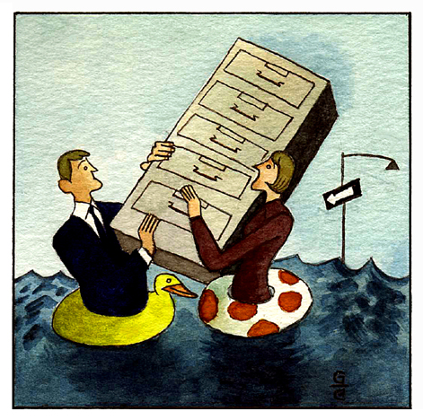
This pen & ink and watercolor drawing just came out in yesterday’s edition of The Wall Street Journal. Always great to work with Mark Tyner, the Art Director of the Sunday page.
The article by Carolyn T. Geer (which you can read in its entirety by clicking here) deals with how to protect financial records from a natural disaster, focusing on the recent devastation caused by Hurricane Sandy here in New York and along the East Coast. Really worth a read, even more so considering we could all benefit from this information next time Mother Nature decides to throw a temper tantrum.