After a whole year of (virtual) silence, I’ve accumulated a variety of notions, experiences, ideas, and scraps that I’d like to inspect and dissect. Would like to give this a shot for the sheer benefit of questioning, understanding, or at the very least perhaps shedding some light on where I’m coming from professionally, and what may (or may not) lie ahead creatively.
To be honest, I’m not sure what compels me to write publicly (as opposed to doing so on a private, old-fashioned paper notebook), since there’s a really good chance anyone who used to pay even the slightest attention to this space has most likely stopped doing so, even long before the previous post appeared. So this inevitably feels a little bit like talking (typing?) into the void. Maybe that’s not a fair or objective assessment, given that I would not want to upset, alienate, or take for granted any (casual or longstanding) visitors or readers. Either way, blogging this here, now—at this particularly uncertain, tumultuous time in the world—though small-minded and narcissistic to an extent as it is, is still fed by the impulse of making an ongoing internal dialogue indeed external; not only in the hope of finding clarity, but maybe also making room for an exchange of ideas or common ground with whomever feels compelled to share their own experiences or opinions.
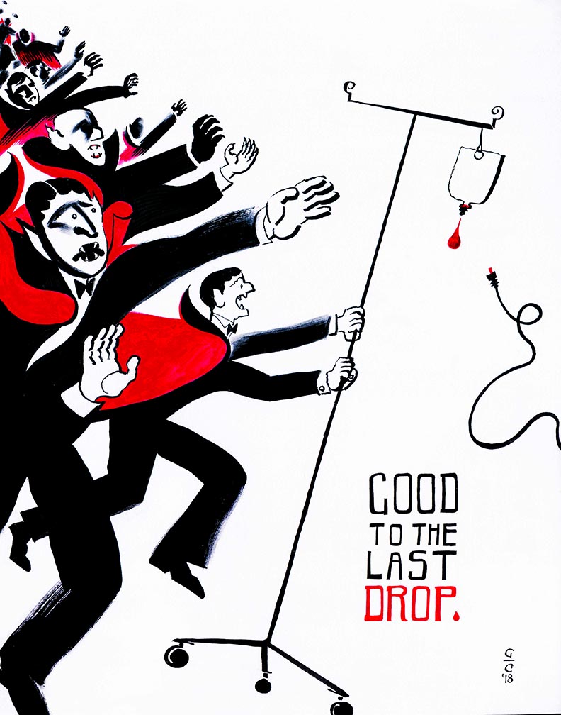
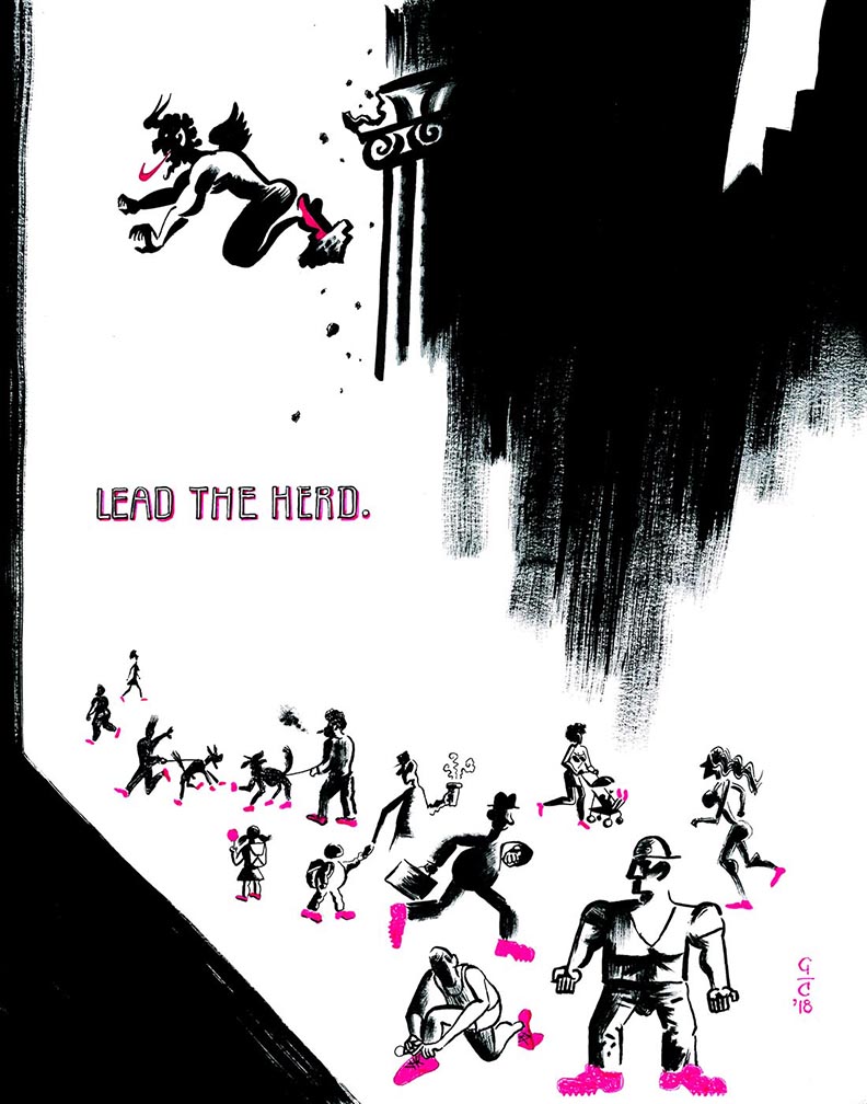
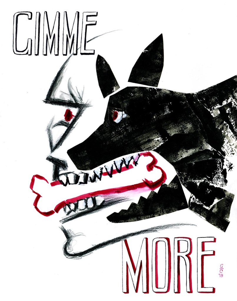
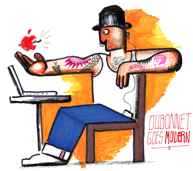
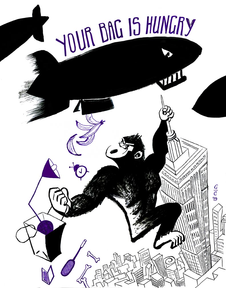
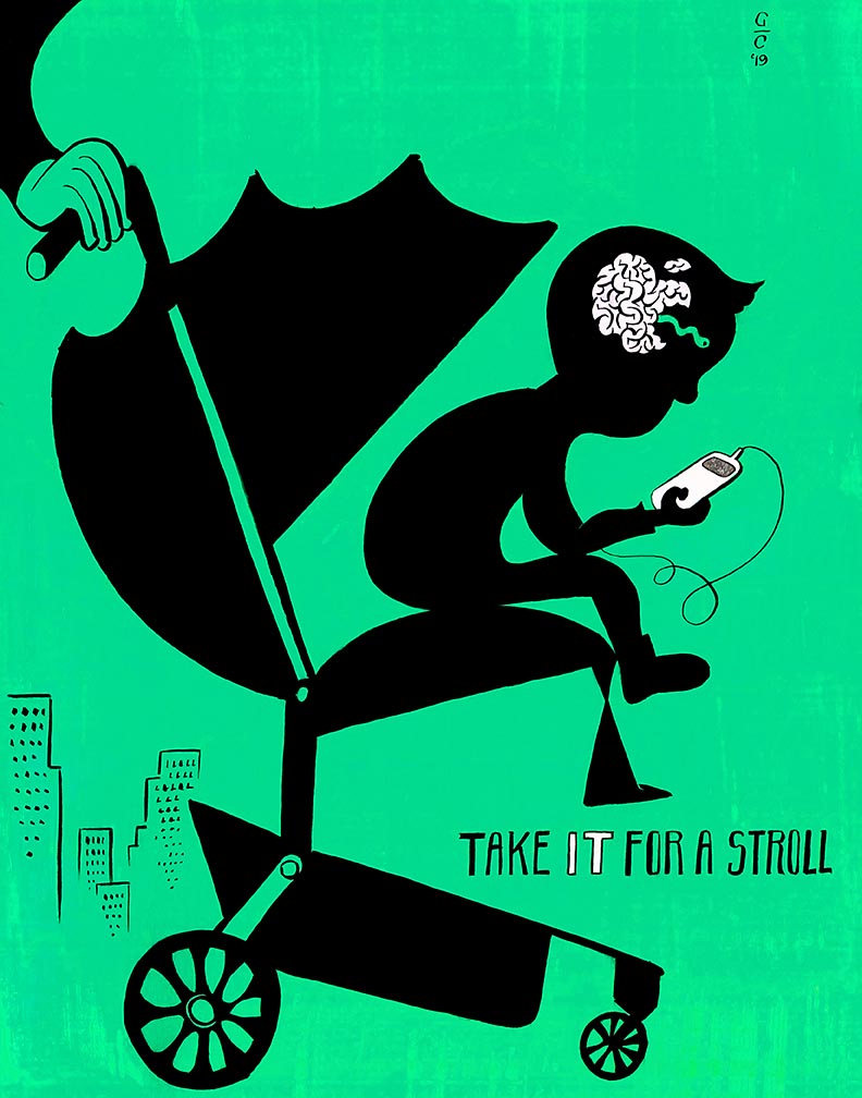
To cease the intrigue—and to start on a rather blunt note—I’ll let the cat out of the bag first: After a promising start in revamping my career as a freelance artist in mid-2018, and a premature drying up of prospects almost exactly a year later, I decided to quit the illustration field for good. I figured it’s been about 18 years of giving it my best shot—in my own flurried but determined ways—and about time I close up shop to seek greener pastures. I guess what sparked this turn of direction was an unshakeable, vague, but persistent dissatisfaction with my both my commissioned illustrations and self-generated projects. Still not sure whether what’s showcased in the various sections of this website truly conveys who I am; not just as a creative person but as a flesh-and-blood individual. The work feels like an idealized, sanitized, commercialized, rather skimpy version of “my best foot forward”. And yet, for better or worse, here it stands: at its best hopefully it shows some promising, thoughtful visual solutions and a dedication to the craft of image-making; while at worst, I suspect the thin, derivative threads of my inconsistent mixed bag of an art career might lay a little too painfully bare.
Isn’t there too much of this stuff out in the world anyway? Thousands of kids graduate art school every year in the United States alone. An alarming percentage of them already have a ridiculously high level of raw skills, as well as being equipped with astute, tech-savvy minds for self-promotional tactics. Compared to these young go-getters, I’m absolutely inept at selling my work. The idea of being indefinitely chained to Instagram, Facebook, Twitter, and countless other platforms in order to show my work to the world—not to mention to constantly struggle to promote it—doesn’t exactly thrill me. I love making images with all kinds of mediums… but then, where (and how) do I even start to get all that work in front of art directors, editors, buyers, collectors, publishers? I’ve tried all the tried-and-true, standard industry methods (and then, timidly, some less conventional others) with some success, but I’d be lying if I said these didn’t feel like emotionally-draining, financially precarious impositions. Can I even compete with these amazingly talented kids and their social media–oriented ways?
Leaving aside the commercial considerations, there are the stubbornly insular inner workings of the field itself (as it is practiced here in the United States) to contend with. Illustrators are, for the most part, at the mercy of self-appointed tastemakers and flash-in-the-pan gatekeepers to get accepted into all the fashionable annual competitions, group exhibitions, invite-only industry parties, and spotlighted outlets. Meanwhile, they work in scattered, socially isolated pockets with little chance of achieving more welcoming, less biased means of exposure. (Of course, there are exceptions, and this mold does get broken sometimes; though whenever this happens, it’s often through self-sufficiency rather than via the untouchable, high-exposure outlets.) “New”, “edgy”, and “fresh” seem to be the tag words de rigueur in juried shows—favored over old fashioned ones like “craft”, “classic” or “timeless”. In fact, I once went to an open live panel featuring the jurors for one of the top illustration annuals, and a couple of them said they had been asked by the annual’s head honchos to focus on those entries that exuded the above catchphrases. Someone else in the panel responded that, of course, “new” and “fresh” didn’t necessarily mean “good” or otherwise worthy of merit. At that point, the discussion abruptly changed course without so much as a tap on the subject. Makes you wonder, doesn’t it?
Then there are the stylistic trends that come and go like the seasons. While I was a wide-eyed, impressionable art student at Pratt Institute in the late ’90s, Roberto Parada and Joe Sorren painted technically spotless, lush images that made the pages of all the big print publications of the day, like Rolling Stone and Time. Their ubiquitousness unfortunately spanned a whole school of faithfuls that watered down their distinctive approaches to largely void, mannered imagery full of long-limbed, big-headed characters. Fast forward 20 years later, and there is more variety in the industry than ever before, often aided by the seemingly infinite virtual box of colors that Photoshop offers. There are the dynamically evocative, woodcut-like renderings of Yuko Shimizu; the astute, self-deprecatingly punchy shortcuts of Christoph Niemann; the moody, conceptual stylings of Brian Stauffer; and the fantastically detailed, virtuosic dreamscapes of Victo Ngai—just to name a few but significant current examples. Surely enough—and just like all those years ago—there are legions out there who shamelessly ape these justifiably celebrated, authoritative voices. Not sure what the actual benefits are of living under the shadow of another artist’s work, other than being ready and willing to pocket those cheaper, lowly commissions that the towering tastemakers refuse to take on. Not a particularly smart career move reeking of longevity, if you ask me—even if it might consistently put food on plates for some.
Trouble is, if you have an approach, whether truly original or not—and, let’s face it, what is “truly original” anymore?—that won’t adhere to the capriciously shifting tides of popular taste, then you’re on your own. In other words, you are not doing work that can be easily pigeonholed or compartmentalized into what the industry finds commercially desirable, so the Powers That Be are less inclined to hire you. This is also likely if you have too many styles or approaches, which make you seem unfocused and unpredictable. Having said that, art directors seem in general to be a little more accepting of jacks-of-all-trades these days (as long as you are master of some) than they were twenty years ago. Of course, there’s the slight chance that, with enough persistence, hard work, and continuous exposure, you might spawn your own army of art doppelgängers, regardless of your approach(es)—and start your own “style trend” in the process. (At this point—and needless to say—you have been waved through the gate. Isn’t that peachy?)
You’ve probably realized by now that I use the word “approach” loosely: from personal experience, I’d say that many art directors and editors nowadays often have a preference for style over content. Which is odd, given that, together, these two are the basis of an “approach” to art—and a symbiotic one too, since you can’t have a well-defined style without solid, mature ideas grounding it. However, style can get in the way of communicating something clearly and directly, if it’s too mannered or bombastic. As for my own image-making, for a couple of years I was deeply dissatisfied with anything I turned out. The succinct, self-contained ideas I usually favored were getting muddied up by surface effects, and by contrived metaphors which were most likely impenetrable to the casual viewer. What’s more, anyone who knows me well (or who’s read my sporadic blogposts) is aware that I’m a life-long fan of German expressionist woodcuts, mid-century modern design, Dada, Bauhaus… Why were these influences not popping up at all in my commissioned illustrations and personal drawings?
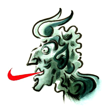
It was time to shake things up a bit: out went the watercolor tubes and muted tonal gradations, and in came the bold dashes of flat color and simplified, inky contours. Images once again started relying on visual puns and direct messages. My website at its current incarnation, having been revamped last year and with a new body of work at its core (along with some older, compatible pieces thrown in for good measure), tries to reflect this reinvention at its best. However—and as I mentioned earlier—I can’t help feeling that it still does not live up to its promise. That itch to go further and the nagging insecurity that the work is not good enough are still lurking in the background, currently standing unresolved.
Since revamping this website, I’ve grown weary of overly aesthetic directions, which I suspect can’t completely be avoided as an illustrator. In all honesty, illustrating by itself is no longer enough; not that it ever has been, but even more so as I get older and dig deeper. The temptation to produce more of my own content grows ever stronger. Sticking to one particular voice and to very specific esthetic choices has also been losing its luster. As of this writing—and full disclosure—I haven’t picked up a pencil in months for many reasons too complicated to go into here; but no less due to all the points recollected in this increasingly ranting report. If I were to dust off my brushes again, I’d probably be leaning towards more abstract and intuitive creative processes—which will surely kill off any existing commercial appeal in my illustrations sooner or later. The works of Marcel Duchamp, Max Ernst, Bruce Conner, and David Lynch have been around for several decades (over a century, in Duchamp and Ernst’s cases), but yet they seem so much more sophisticated, alluringly mysterious and refreshingly surprising to me than most of what I’ve been seeing on illustration annuals and websites in the last ten years or so.
Rounding all of this up is the fact that, for almost a full year now, I’ve become a full-fledged member of the St. Martin’s Press design team here in New York, creating page layouts and typesetting book interiors for many of its imprints. Once a long-time dream, and now a daily creative challenge that I whole-heartedly welcome and nurture. Just like illustration, publishing is a tough industry to break into, but—through multiple ventures, projects, connections, and sources of employment—it has been a big part of my life for the better part of two decades, and therefore more welcoming to me than illustration’s guarding lions.
So yes, introspection, insecurities, disillusionment, career moves, and new influences are all pointing at a drift away from a field that I used to be obsessed with, but that—for one reason or another—consistently disappoints and alienates me. Don’t get me wrong, though: illustration is a multi-layered career with a broad and diverse scope. Grounded as much on tradition as it is on innovation, is spurred on by humanity’s need for visual storytelling, and evolves rapidly through digital technology’s unquenchable hunger for new mediums of communication. (Having said that, I find it ironic that hardly anyone seems to be aware of illustration as a profession and as a source of accessible imagery, given how much it has been absorbed—as well as reciprocally informed—by pop culture for over a hundred years.) At its best, it cuts directly to the core of a topic by informing and re-imagining. At its worst, it becomes a dull, cliched, easily ignorable addendum to a news article or e-book front cover.
If you’ve read this far, you’re probably sensing a certain bitterness coming through in these words, and I’d be the last to dispute or correct you. However, as you’ve seen above, this does not represent a move away from creative endeavors—actually quite far from it, since I am still designing, inventing, composing, performing, planning, devising, arranging, absorbing, recording, researching, learning, living—just from the one profession that (ironically and sadly) has brought me more joy but also far more frustration than any other.
