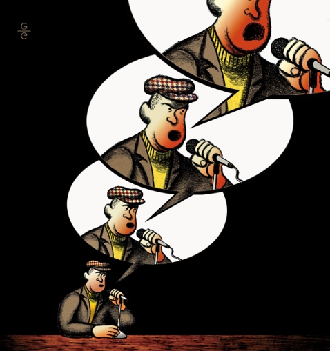
Sometimes the simplest of ideas drive through some bumpy roads before emerging triumphantly. Other times, whatever comes out of the tunnel bears only a vague resemblance to the original scribble in your sketchbook—which can be a drag or a boost, depending on your intentions. A bit of both happened with this particular assignment.
This illustration is appearing in the January issue of Reader’s Digest UK, due in newsstands across the pond sometime this month (still not sure if it’s available here in the US or elsewhere). The article it accompanies delves into British news media’s current preference for the viewpoints of non-experts on any given topic, and questions how this focus could influence the way we perceive information.
I had the pleasure of working once again with the Digest‘s design director Martin Colyer, who vastly improved my original idea by suggesting that the opinionated fellow in the drawing should grow angrier with each speech balloon. Initial (admittedly undercooked) sketch posted below…

The article reawakened the cartoonist in me. This proved to be a golden opportunity to have fun with characterization (as seen in the finished piece): enriching the idea with descriptive visual details about the “leading man”, while being careful to not overpower the image with superfluous information. It was tempting to render the whole thing with pen & ink and lush watercolors, but I realized right away that such a direct, catchy pun demanded a more, um… full-throated approach.
And so, Photoshop came to the rescue to put it all together: I drew our spot-lit spokesman with wax crayon (a medium I’m scarcely comfortable with) to emphasize his gruff street-wise roots; rendering each increasing frown and widening mouth separately, then composing them together digitally. Textures and patterns such as the houndstooth print on his cap (“sampled” from one of my wife’s vintage dresses) and the table he leans on (an unused shelf from my bookcase that I placed directly into my scanner) were also collaged in via Photoshop to add some visual interest. Even though I’ve used Photoshop to compose images before, I’m very glad I went with my instincts, tried some new variations on the usual methods, and ultimately avoided going down some of the more familiar routes.
The image then went through some minor aesthetic revisions, mostly to avoid dropping our flustered hero into the unavoidable page gutter (the narrow space in the binding between two pages) over which the printed article would spread. Indirectly, this was probably the biggest challenge proposed by the assignment, and one I always look forward to: how to balance all pictorial elements in the composition and pack the required punch, while working with specific page layout and print format restraints.
It’s difficult to take chances with commissioned work when a deadline is looming, but once we settled on the right idea, the art director gave me carte blanche to try whatever I pleased, approach-wise. Many thanks to Martin for trusting me enough to get on with it, and to the somewhat unpredictable wonders of digital technology for giving me enough guts to temporarily forget that failure is always an option.
