Photo: courtesy of Martin Colyer.
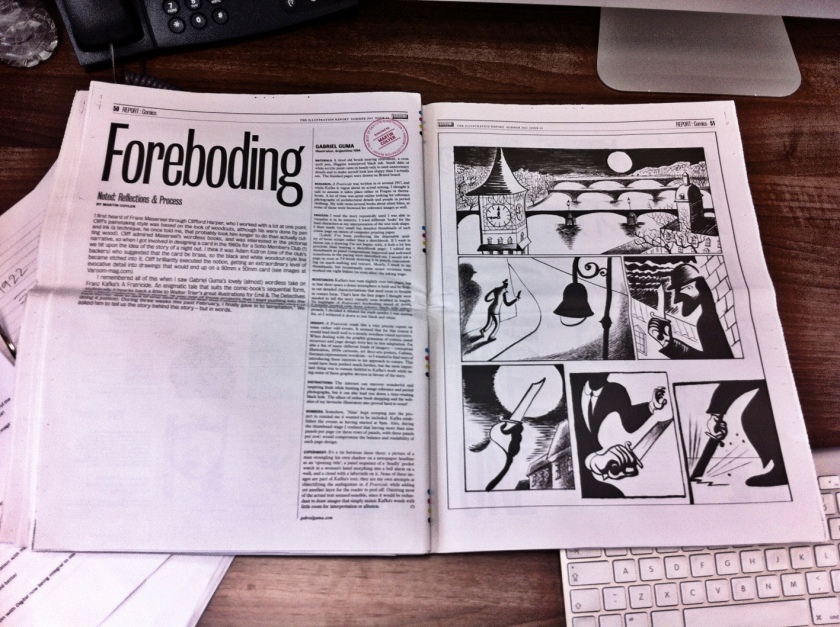
I’m thrilled to announce that the self-initiated comics adaptation of Kafka’s A Fratricide that I worked on earlier this year has found a happy home in the pages of Varoom!, a magazine devoted to contemporary illustration published by the Association of Illustrators (AOI) in the UK. It came out this past June in issue #22, dedicated to experimentation.
Not only they’ve published the eight-page comic in its entirety, I also got to fill out a fun behind-the-scenes questionnaire. Just got hold of my copy of the magazine, so here’s the article’s text in its entirety. Many thanks to Martin Colyer for the kind words and for making this happen.
I first heard of Frans Masereel through Clifford Harper who I worked with a lot at one point. Cliff’s painstaking style was based on the look of woodcuts, although his were done by pen and ink (a technique, he once told me, that probably took him longer to do than actually cutting wood). Cliff admired Masereel’s wordless books, and was interested in the pictorial narrative, so when I got involved in designing a card in the 1980s for a Soho Members Club (!) we hit upon the idea of the story of a night out. I think it was Adam Kidron (one of the club’s backers) who suggested that the card be brass, so the black and white woodcut-style line became etched into it. Cliff brilliantly executed the notion, getting an extraordinary level of evocative detail into drawings that would end up on a 90mm x 50mm card (see images at Varoom-mag.com).
I remembered all of this when I saw Gabriel Guma’s lovely (almost) wordless take on Franz Kafka’s A Fratricide. An enigmatic tale that suits the comic-book’s sequential form, stylistically it harks back a little to Walter Trier’s great illustrations for Emil & The Detectives and Lilliput magazine. Says Guma: “It was one of those projects that I kept pushing into the back-burner due to lack of time (and a secret fear that I would fall embarrassingly short of doing it justice). During three weeks this past February, I finally gave in to temptation.” We asked him to tell us the story behind this story, but in words.
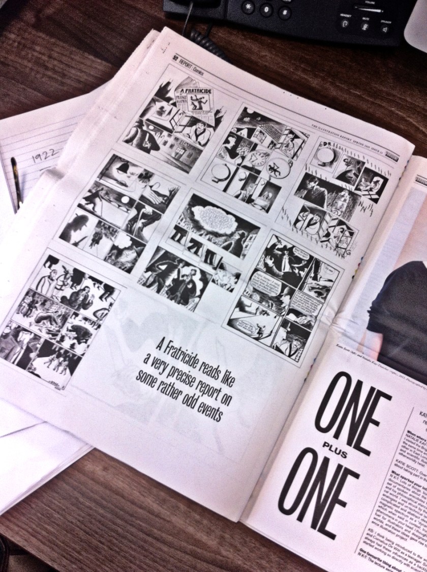
Photo: courtesy of Martin Colyer.
Materials: A tired old brush nearing retirement, a crow quill pen, Higgins waterproof black ink. Small dabs of white acrylic paint came in handy only to omit unnecessary details and to make myself look less sloppy than I actually am. The finished pages were drawn on Bristol board.
Research: A Fratricide was written in or around 1917, and while Kafka is vague about its actual setting, I thought it safe to assume it takes place either in Prague or thereabouts. A lot of time was spent online looking for reference photographs of architectural details and people in period clothing. My wife owns several books about silent films, so some of those were browsed for reference images as well.
Process: I read the story repeatedly until I was able to visualize it in its entirety. I tried different “looks” for the lead characters as my interpretation of the text took shape. I then made very small but detailed thumbnails of each comic page on sheets of computer printing paper.
Resistances: Kafka’s text runs slightly over two pages, but in that short space a dense atmosphere is built and he fleshes out detailed characterisations that need room to breathe in comics form. That’s how the four pages I thought were needed to tell the story visually soon doubled in length. To highlight A Fratricide‘s foreboding mood of doom, I initially worked with three colours: black, pale yellow, and gray-blue. After producing a test page with this approach, I decided it diluted the stark quality I was aiming for, so I withered it down to just black and white.
Insight: A Fratricide reads like a very precise report on some rather odd events. It seemed that for this reason it would lend itself well to a mostly wordless visual narrative. When dealing with the graphic grammar of comics, panel structure and page design were key in this adaptation. I’m also a fan of many different kinds of imagery—conceptual illustration, 1950s cartoons, art deco-era posters, Cubism, German expressionist woodcuts—so I wanted to find ways of introducing those interests to my approach to comics. This could have been pushed much further, but the most important thing was to remain faithful to Kafka’s work while using some of these graphic devices in favour of the story.
Distractions: The Internet can uncover wonderful and inspiring finds while hunting for image reference and period photographs, but it can also lead you down a time-wasting black hole. The allure of online book shopping and the websites of my favourite illustrators also proved hard to resist!

Numbers: Somehow, “Nine” kept creeping into the project to remind me it wanted to be included. Kafka establishes the events as having started at 9 pm. Also, during the thumbnail stage I realised that having more than nine panels per page (or three rows of panels, with three panels per row) would compromise the balance and readability of each page design.
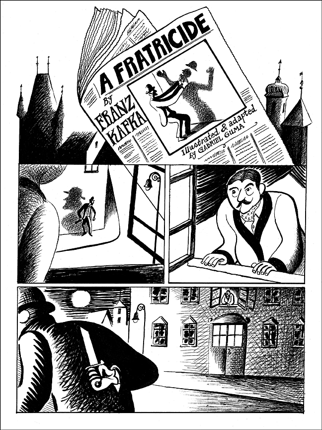
Experiment: It’s a tie between these three: a picture of a man strangling his own shadow on a newspaper headline as an “opening title”, a panel sequence of a “deadly” pocket watch in a woman’s hand morphing into a bell alarm on a wall, and a cloud with a labyrinth on it. None of these images are part of Kafka’s text; they are my own attempts at objectifying the ambiguities in A Fratricide while adding yet another layer for the reader to peel off. Omitting most of the actual text seemed sensible, since it would be redundant to draw images that simply mimic Kafka’s words with little room for interpretation or allusion.
The entire issue features some beautiful work by both up-and-coming and well-established international artists; as well as some engrossing, thought-provoking articles. Still not sure if Varoom! is available here in the US, but you can purchase this issue (as well as many previous ones) at the AOI shop. You can find my entire adaptation of A Fratricide in the Comics/Sequential gallery of this site.
