For close to five years now, I’ve been wanting to do a comics adaptation of Franz Kafka‘s short story A Fratricide. It was one of those projects that I kept pushing into the back-burner due to lack of time (and a secret fear that I would fall embarrassingly short of doing it justice). During three weeks this past February, I finally gave in to temptation, and I’m pleased to say I’m quite content with the results.
Here’s the 8-page, mostly wordless adaptation in its entirety, starting with the first page at the top. (Feel free to click on each page to see it bigger.)


I’ve always been a fan of comics (or is it comix, nowadays?). In fact, they were my first love, way before they metamorphosed and ascended onto the Graphic Novel Pantheon, sometime in the late ’80s. (Isn’t a graphic novel just a fat comic for grown ups, when it comes down to it?) When I was a kid, I used to favor stories of colorful guys in capes punching each other out. That all changed in my late teens when my family moved to the US and I discovered that–surprise, surprise!–the medium’s narrative immediacy and pictorial strengths were ideal for telling complex stories about human beings and real feelings. My impressionable young mind had been irredeemably blown away by the works of Alberto Breccia, Lorenzo Mattotti, Harvey Kurtzman, José Muñoz & Carlos Sampayo, Neil Gaiman & Dave McKean, and an even longer etcetera of genre-defining innovators.
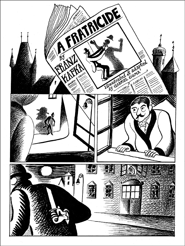
This Kafka story, which is less than three pages long in its original form, seemed perfect for comics. In A Fratricide, Kafka paints a rather unsettling tale with gothic overtones, which constantly hints there is much more than meets the eye, but you can’t quite put your finger on what that is. As its title suggests, someone murders his brother, but when reading the original story it becomes immediately obvious that the hunter and the victim don’t share the same last name. And that is just one of the many puzzling but engaging attributes of a story that relies on foreboding moods and near-surreal ambiguities; much more than it is a straight-forward murder fantasy. (And of course, Kafka is rarely that crystal-clear, or even logical.)
It seemed to me that the best way to adapt A Fratricide to comics form was to omit most of the text and let the pictures do all the talking; the big exception to this being the speech by Schmar after the murder takes place. Kafka is rather minimal, even abstract, when defining the motives and reasoning behind the events and characters in the story, but he is quite precise when describing the events themselves and how they take place. This is what, to me, makes the story so visually clear and explicit when it comes to narrative direction, but simultaneously open to different interpretations and meanings.
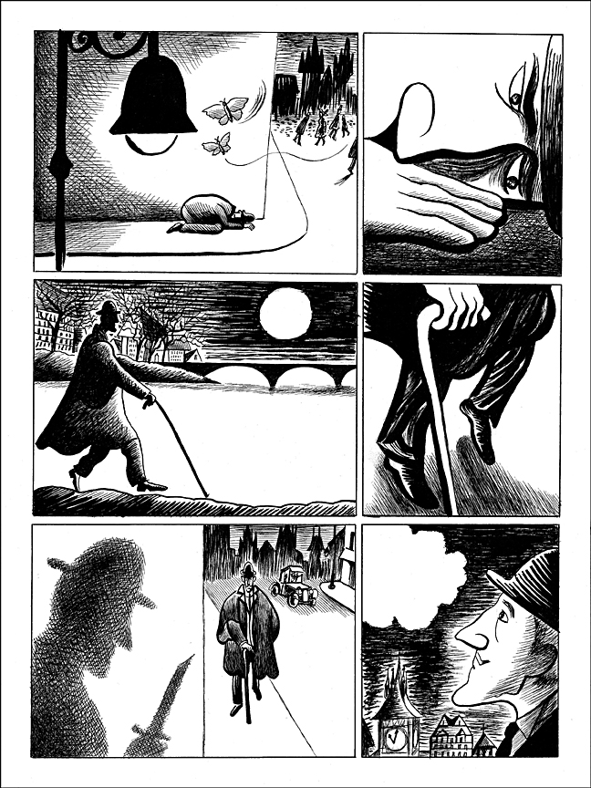
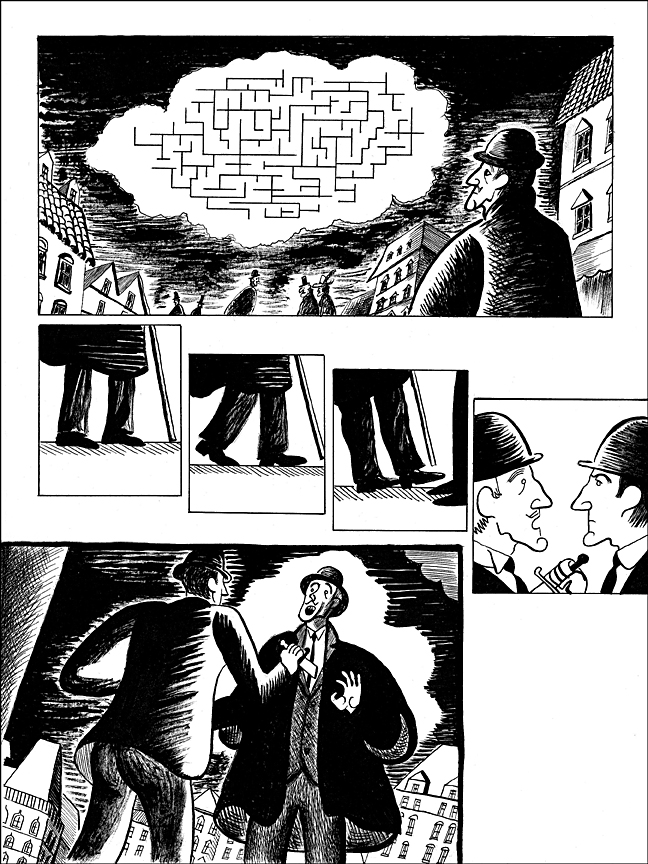
In terms of pacing and storytelling, I thought a lot about how each page was going to be structured and designed for maximum effect. Using the page as a self-contained unit of information, I came to realize that comics lend themselves to many different types of graphic languages. Comics can be a vehicle for cartoons, and cartoons are not that far off from abstraction, which is in turn related to graphs and symbols. As long as you don’t get too abstract or muddled, you can have all these forms happily coexisting on the same visual plane. (Yep, you can blame Art Spiegelman and Scott McCloud — their wonderful theories about the medium got me thinking!) That’s how, on page 3, the story lent itself to have an antique pocket watch turning into an alarm bell through the visual pacing, and on page 7 there’s a labyrinth on a cloud, which is really just a graph meant to symbolize Wese’s state of confusion and his own impending fate.
This idea also reflects my willingness to gently introduce the kind of imagery that’s the bread-and-butter of conceptual (or metaphorical) editorial illustration, but that has been largely unexplored in comics for the most part. This also led me to play a bit with the “opening titles”, having the murderer strangling his own shadow on the front page of the newspaper, on page 2. These images are not part of Kafka’s original tale; they are my attempt to enhance and complement the events and suggested meanings in the story. And illustrating the narrative in black and white seemed like a no-brainer given its tone, which I think would not have worked as well in color. Lacking color persuaded me to be more creative and concise with solutions to issues of design and rendering, because it limits the pictorial possibilities to the essentials. Besides, it’s refreshing to give color a break every now and again, and concentrate on the delights of pure drawing.
Done. Now, if anyone out there would like to dabble into some, um… Kafkaesque adventures in comics publishing, please don’t hesitate to contact me…

Thanks so much!